kellie thompson

The Problem
High schools across the nation are seeing a shortage of athletic coaches. It is difficult in rural areas, due to the low population, to find qualified track and field coaches, especially in specialized events. Unqualified coaches and volunteers are stepping in to help. Providing coaching knowledge in the hands of these coaches would help fill in the gaps that the shortage has caused. I used the design-thinking methodology for this project, which includes 5 stages: empathize, define, ideate, prototype, and test.
My Role
End to end UX/UI designer.
Tools
Figma, Miro, Marvel, paper, pen
Finding coaches to fill positions is a challenge. In a rural school, there might be three applicants
for an open position. If two of them are not qualified, you are only interviewing one person.
If he or she does not “fit” the position, you either have to hire the applicant and hope to “mold”
him or her, or you are back to the drawing board.
"
"
- Lisa Myran-Schutte, CAA, NFHS.org
Desk Research
In order to get a better understanding of the problem, I researched and read articles about coaching across the nation. One of the biggest factors my research revealed is that there is a shortage of high school teachers which leads to a shortage of coaches. My research also revealed the following:
1. High school track and field coaches are highly understaffed. They may have 1 coach for every 25+ student athletes.
2. Smaller school districts don’t have the resources to stay competitive with larger schools due to the ability to staff and fund their programs
3. Trying to find specialized coaches has become a challenge for schools. Some programs get cut because they can’t find a qualified coach. Rural school districts lack the access to specialized coaches
Final considerations
When schools have to fill the positions they often use volunteers or coaches who are not qualified in that sport. Providing knowledge of track and field events in the hands of these coaches would help fill in the gaps that the shortage has caused. It would also improve an athlete’s performance.
68
SCREENER SURVEYS
Sent to 1A and 2A high school track and field coaches in Idaho via Google Forms.
5
user interviews
Participants used digital technology, had frustrations with coaching, and worked with fewer than 3 assistant coaches.
WHAT RESOURCES HAVE YOU USED TO HELP COACH YOUR ATHLETES?
100%
OTHER COACHES
88.9%
INTERNET SEARCHES
77.8%
YOUTUBE
User Interviews
From the participants from my screener survey, I conducted 5 semi structured interviews. These were done remotely via Google Meet. Interviews were recorded so that I could go back and review the interview and gather insights from the users.
“YouTube training videos taught me to coach my athletes better technique then what I already knew but I would need additional resources to take them to the next level.”
- Drennan Wesley, Community School Head Track Coach
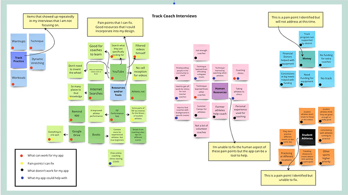
Thematic Analysis
In order to organize my notes of the user interviews, I created an affinity diagram writing important data points on post-its. I categorized different groups by using different colors. This helped me see my different themes from my interviews. I also identified what pain points I could help with, areas I wouldn’t be able to address with this project, non-applicable points and areas where my project could help.
I found that the pain points I could address in my design were the resources and tools that track coaches use.
Empathy Mapping
To further understand my user, I created an empathy map. This helped me better understand the user's pain points, goals, feelings, thoughts and behaviors. Seeing the points from my user's point of view will help guid my design.
User Interviews
From the participants from my screener survey, I conducted 5 semi structured interviews. By conducting interviews I was able to gather insight on the frustrations and pain points that rural coaches have. It helped me to understand my user and empathize with their problems.
“YouTube training videos taught me to coach my athletes better technique then what I already knew but I would need additional resources to take them to the next level.”
- Drennan W., Head Track Coach
Thematic Analysis
Organizing my notes of the user interviews, I created an affinity diagram. It helped me to visualize the major themes with the user. I categorized the different themes by colors. The major themes that popped up were the resources and tools coaches used, human resources, money, student athletes and track practices. Resources and tools track coaches used is an area I want to focus my design on.

Click image to go to original file.
Empathy Mapping
Creating an empathy map, helped me to connect to the user's pain points, goals, feelings, thoughts and behaviors. Seeing the points from my user's point of view helped keep my design focused on the user and not the product. What do they want to gain? What are their frustrations?

Click image to go to original file.
User Insights
Through the process of research and empathizing, I was able to gather valuable insights of the user. These ideas helped guide my design.
-
Searched for videos to teach them
-
Searched the Internet
-
Talked to other coaches
-
Talked to former collegiate athletes
-
So many different places to find content
Who am I designing for?
I created four personas that would use my app. Each user has different behaviors, level of experience and use of digital tools. This lead to me to identify the goals that need to be met to provide a good user experience across the personas.
PERSONAS
1. Skillful Instructor
2. Low Tech Master
3. High Tech Newbie
4. Tech Savvy Volunteer
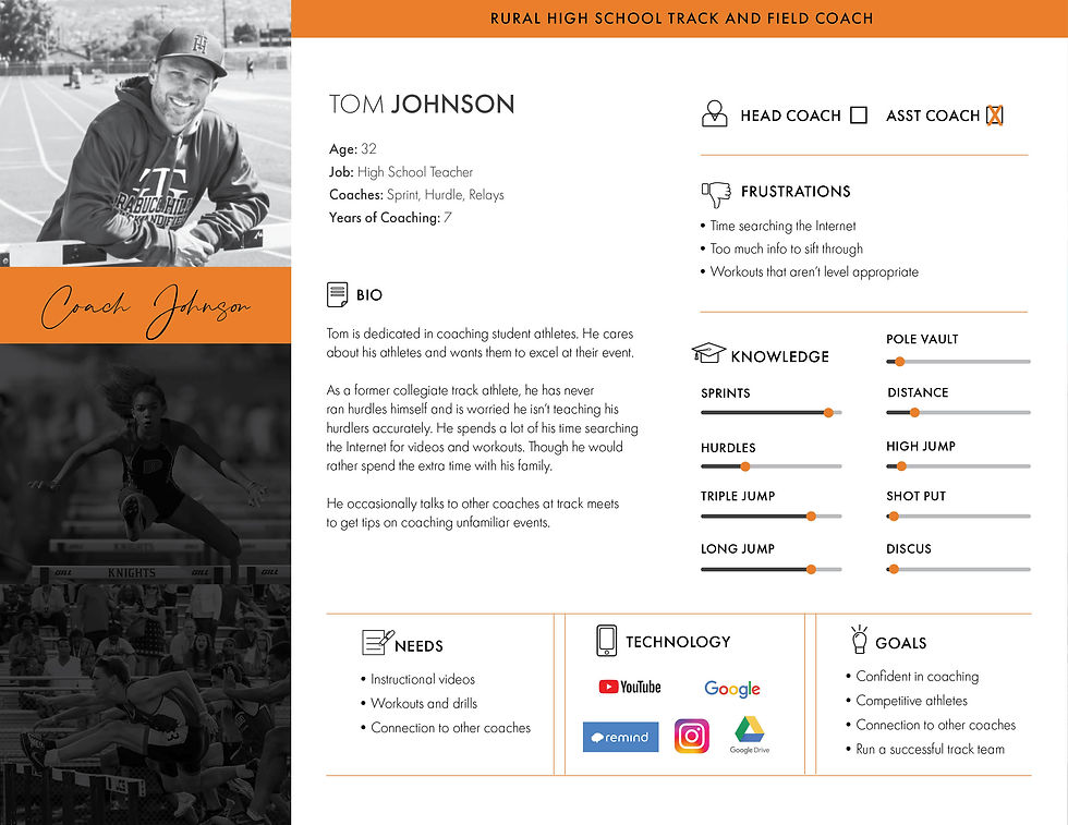
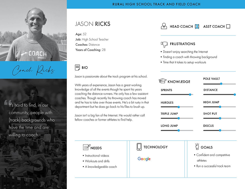
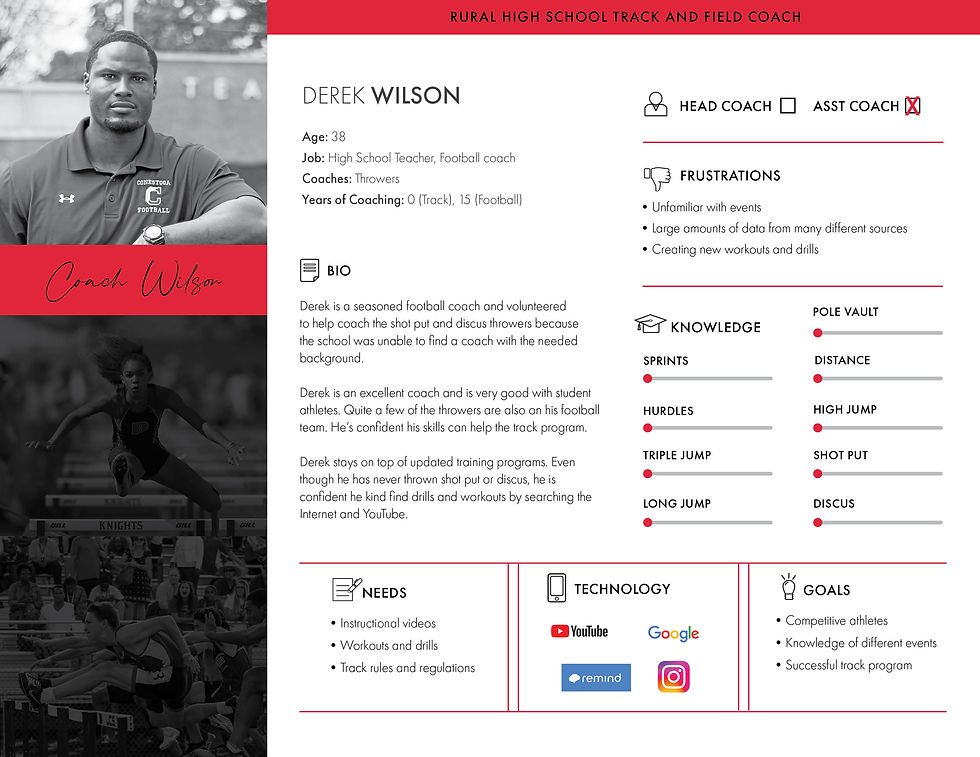
FRUSTRATIONS
Don't have access to qualified coaches
Unfamiliar with events
Time searching the Internet
Creating level appropriate workouts
Large amounts of data from many sources
GOALS
Run a successful track program, build confidence
in coaching, develop
competitive athletes and
gain knowledge in other events.
HMW?
PROBLEM STATMENTS
How might we help track coaches be more knowledgeable in
unfamiliar events?
How might we help make the process of finding relevant content easier?
How might we help build confidence and knowledge in track coaches?
How might we help coaches find new and improved techniques?
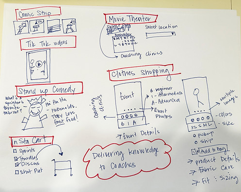
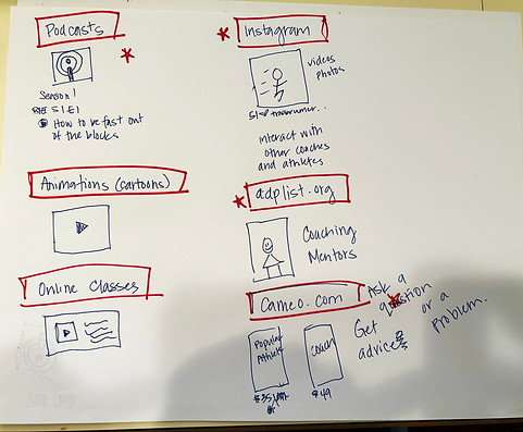
Ideate
Taking my HMW questions into consideration, I brainstormed different ideas that could potential solve my problem. The initial round didn't spark wasn't too happy with all of the ideas. They seemed pretty ordinary.

I did another round of brainstorming ideas to help push past and expand my initial ideas I wanted to find the best possible solution for the user. I tried thinking out of the box and mashing up different ideas to spark more creative ideas. One of my favorite ideas that I incorporated in my design was adplist.org. I liked the idea of coaches being able to connect with other coaches for advice and help.
User Stories
I created user stories to articulate the needs of the users and think about how they will use my app. Once I wrote them out I mapped them out and deciphered what my MVPs were.
-
As a user, I want to quickly find event categories so that I can learn event rules and regulations.
-
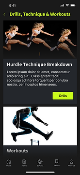
As a user, I want to find drills and techniques for specific events so that I can coach my athletes more effectively.
-
As a user, I want to find workouts for specific events so that I can coach my athletes more effectively.
-
As a user, I want to find track videos so that I can visually be taught techniques for a certain event.
-
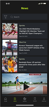
As a user, I want to read track articles so that I can stay up-to-date on the sport.
-
As a user, I want to search for relevant content for events so that I can gain more knowledge.
-
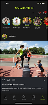
As a user, I want to join a community of coaches so that I can share my experiences with others in the coaching community.

Click image to go to original file.
User Flows
My MVPs helped me define the 4 major critical paths that the users would take: finding event information, searching content, setting a up a profile and making an appointment with a mentor. These are outlined in the user flow chart below.

Click image to go to original file.
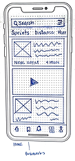
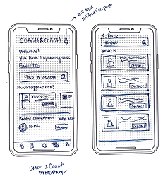
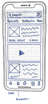
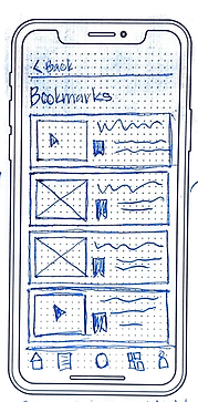
Early Sketches
I created low fidelity sketches of my critical routes to get my initial designs onto paper.

GUERILLA
TESTING
Testing
I uploaded my sketches to Marvel to create a working prototype and did guerilla testing to get feedback from users. This helped me workout problems that I could fix early on in the design process. Below are a few of my findings.
Users went straight
to the events buttons. Search was used as
a secondary option.
I needed to make the event buttons more prominent. It is a primary route for the user.
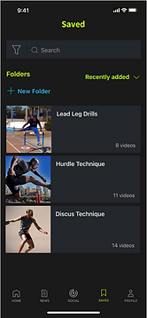
Users suggested having the option to create folders to help keep saved items organized.
Create screens to allow the user to create folders.
Users suggested for an option to select what events they want to see info about.
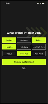
Create a way for the user to filter content...while onboarding?
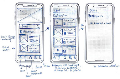
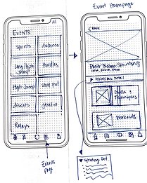
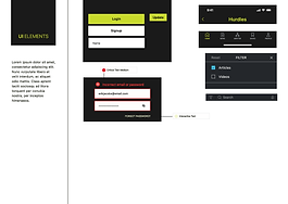
Sketches to wireframes to wireflows
I took my sketches and built out wireframes to get more of an idea of what the content and UI elements would look like on a mobile screen. I also set up a wire flow to see the critical routes a user would take.

Click image to go to original file.

Click image to go to original file.
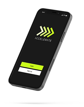
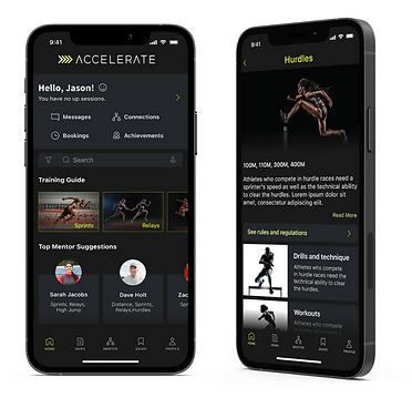
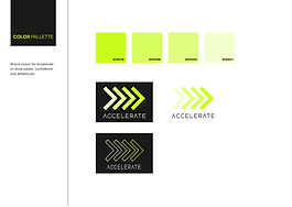
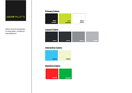
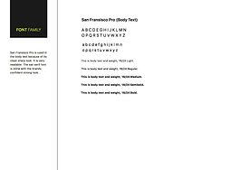
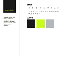
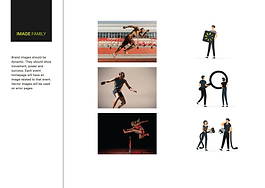
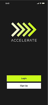
Branding
Creating a brand for the app, I wanted the colors, fonts, imagery contributed to convey confidence, success and athleticism. Below are my visual design choices and my first high fidelity mockups.
Mood board
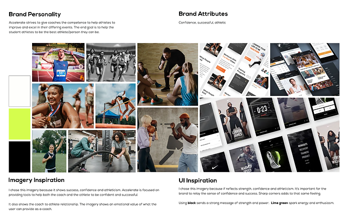
Style Guide
High fidelity
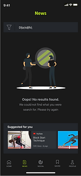
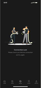
Edge cases
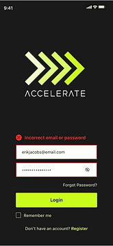
Usability testing 1
My first round of usability gave me a lot of insight on on what didn't work with my app. Below are a few of issues the users came across.
No search bar. Users wanted to search first.
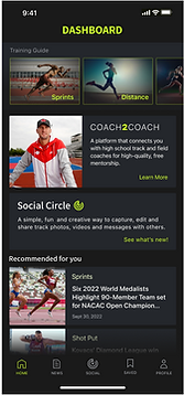
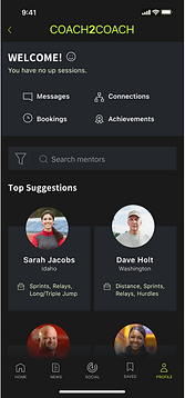
Social Circle card is redundant. Icon is at the bottom.
Homepage not as engaging. Would be great to have it like C2C dashboard
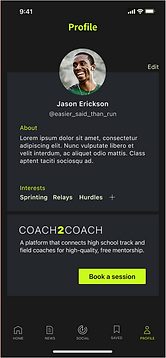
Users were confused why the Coach2Coach card on the homepage led them to the Profile page. Why is there?
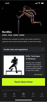
Touch down timer button draws too much attention for its level of importance.
Too many clicks to get to workouts and/or drills.
Redesign
I evaluated the feedback from the users on the first round of testing and I did a redesign before I did the second round of testing.
-
Logo replaced "dashboard" at the top
-
Search bar added
-
More engaging dashboard
-
Redesign of content
-
Coach2Coach removed from Profile page
-
Social circle removed from app
-
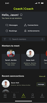
Mentoring has its own landing page and replaced Social Circle on the navigation bar at the bottom of screen
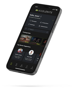
Usability testing 2
The second round of testing went really well. Users were able to easily complete the tasks. There was only one minor issue that the users had when searching for Rules and Regulations. It took the user 4 or 5 seconds to find that button. I went back and changed the font color to help it pop out visually.
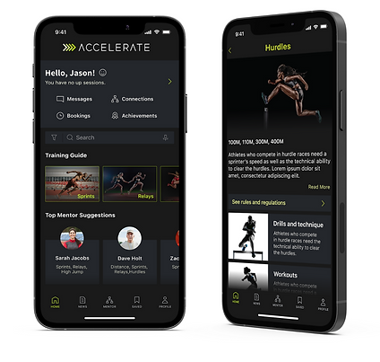
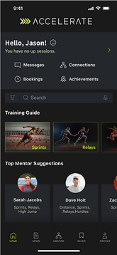
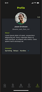
Prototype
Conclusion
ACHIEVEMENTS: I was excited to have learned the end to end process of taking a user problem and finding a solution. Learning to be an empathic designer was a great learning curve. Listening to the users needs, defining the problem, ideating, designing, testing, ideating, prototyping helped be more fluid and flexible in my design process...not to be stuck on one idea.
CHANGE: Looking back I see many areas I could have done better. One area in particular is having better interview questions in the screener and semi structured interviews. This would have helped me retrieve more specific data that would have guided me better.
