kellie thompson


INTRODUCTION
North Fork sells bikes on their mobile-web site. They need to enhance their browsing and checkout experience to improve their site's usability. They also want to improve the conversion from browse to completion of checkout to increase revenue.
MY ROLE
UX/UI Designer
TOOLS
Figma, Photoshop, paper, pen

Deciding
Data shows 50% of their users open on average 7 item pages and then abandon the site without moving any items into the cart.
Checkout
Additionally, 70% of users who place an item in the cart do not purchase. Data shows that users abandon the cart at the registration page.

UNDERSTANDING THE PROBLEM
Deciding - Our hypothesis is that users are unable to determine which bike is best based on relative features, causing users to abandon the site.
Checkout - Currently on North Fork's site, users must make an account to purchase. A guest checkout is needed to solve for this problem. The guest checkout must capture user's email.
HOW DO WE HELP THE USER'S DECIDE WHICH BIKE IS BEST?
I researched 4 competitor's sites: Specialized, Trek, Giant and Santa Cruz. To identify a solution for conversion rates by helping the user decide which bike to buy, I found that doing a bike comparison is the most efficient way to do this. Below are elements I want to include in my design.
Trek had the compare button on the main shopping page, making it easy to quickly select bikes you want to look at. Other sites you had to go into the product page to find the compare button.
TREK
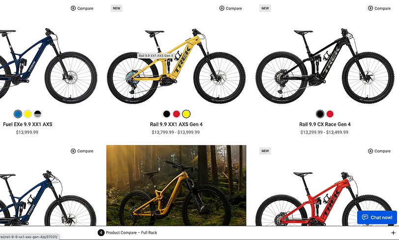
What I didn't like was the visibility of the comparison rack button. The color is too similar to the window bar at the bottom. It took me awhile to figure out where it was in order to click it.
In my design, I want the user to easily find the compare button to help reduce frustrations in finding it.
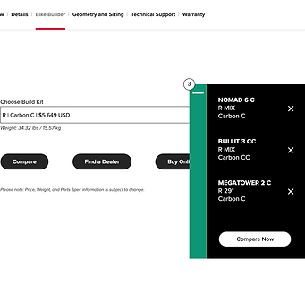
Santa Cruz has a great compare rack. It visually pops and is easily located. The button is sticky on the page as the user scrolls and moves to other product pages.
SANTA CRUZ

HOW DO WE HELP REDUCE CART ABANDONMENT DURING THE CHECKOUT PROCESS?
My hypothesis to reduce cart abandonment at the registration page is to provide the user with guest checkout as an option. This will allow the user to checkout without having to go through the registration process.
Specialized has an excellent guest button. It has a pop up screen that clearly shows the user two options. Very clear and concise.
SPECIALIZED
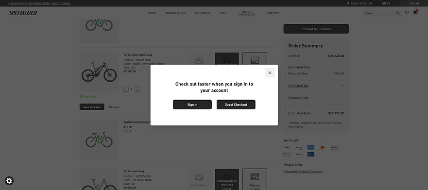
I also like their 1,2,3 step checkout process. Users can visually see what information is expected from them from the beginning. They also capture user's emails on the first step. They also clearly state why the information is needed.

USER FLOWS
There are two user flows for the problems we are solving. First flow shows the user's journey through comparing bikes. While the second flow shows the user's journey through guest checkout.

* Click on image to go to original file.
Wireframes
Building out the wireframes, I incorporated ideas from my comparative research that I wanted to test.
User Flow 1 - Comparing bikes
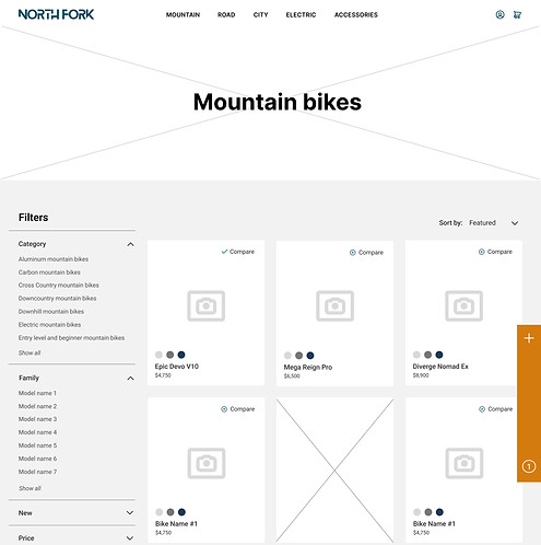
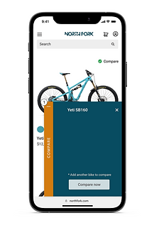
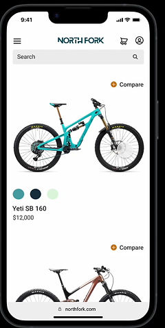
Compare button is located on the homepage and product page allowing user to click it on which ever page they are on.
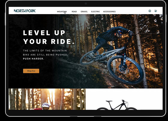
Mountain bike homepage
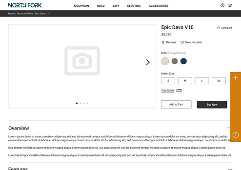
Comparison rack is set as a sticky sidebar. Sidebar will remain on screen as they move throughout site until rack is emptied.
Product page
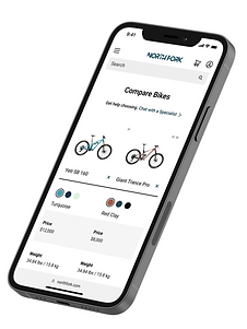
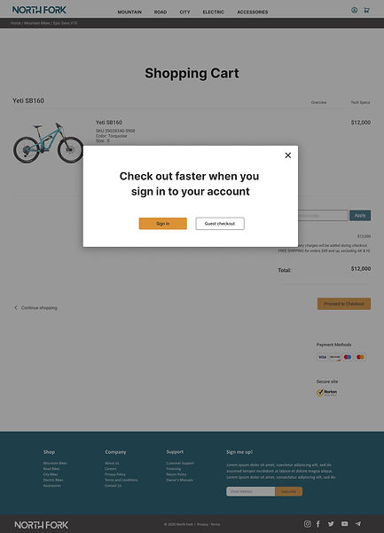
User Flow 2 - Guest checkout
Checkout pop-up shows up when clicking on "Proceed to Checkout" button on the shopping cart page and the "Buy Now" button on the product page.
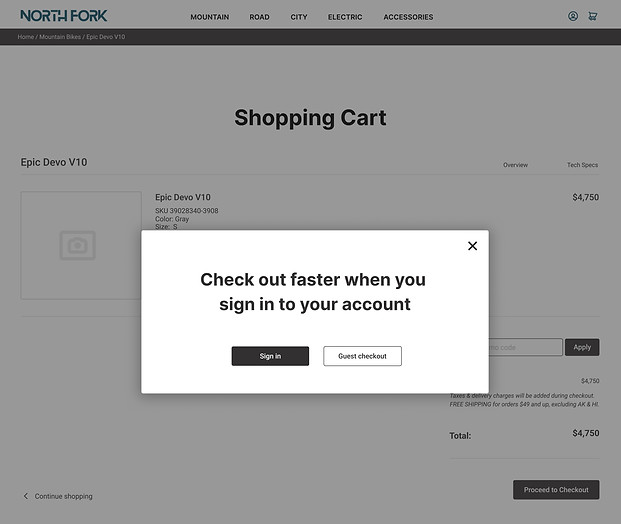
Shopping cart page pop-up
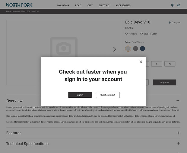
Product page pop-up
1,2,3 checkout process with text that lets the user know why the information is needed.

Checkout process

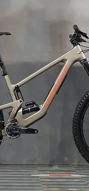
Target User
• 24 - 38 years old
● User base is 72% men
● High income earners
● They take biking very seriously.
They will spend a lot of money on this investment. They are very picky and do their research


Wireframe Usability Testing
To test the hypothesis for the two user flows, I recruited 5 local participants that fit the target user for North Fork. The test script will have the participant do two tasks:
• Use the site to help them decide between 3 bikes (Flow 1).
• To checkout without having North Fork capture information and avoid receiving spam emails/newsletters (Flow 2).
Results from Flow 1
I didn't know if the sidebar was just to add bikes. Could you label the sidebar so I know what it is for?
I didn't see the compare button the first time. Is there a way to make it bigger or stand out?
3/5
Participants
Suggested labeling the compare sidebar.
4/5
Participants

Took over 30 seconds to find the compare button
Participants were slow to find the compare button on the mountain bike homepage. No one chose the compare button on the product page. Participants also felt that the compare sidebar needed to be label to reassure the user of it's use.
Results from Flow 2
When I am purchasing and want to quickly checkout, I don't want to have to set up an account. I almost always choose Guest Checkout.
Participants all chose guest checkout and felt like the process was seamless and current with industry standard.
Action to be taken
The compare button and the compare sidebar need attention. Labeling the sidebar will help the user understand its purpose. I will also need to make the compare button stand out more to catch the eye of users.
High Fidelity

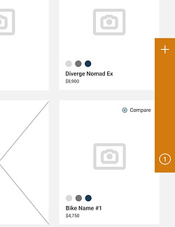
COMPARE BUTTON
Made bold. Bright orange "+" button to catch user's eye and to correlate with the side bar
COMPARE SIDEBAR
Labeled to clarify use.
Shadow added for pop.
Guest Checkout
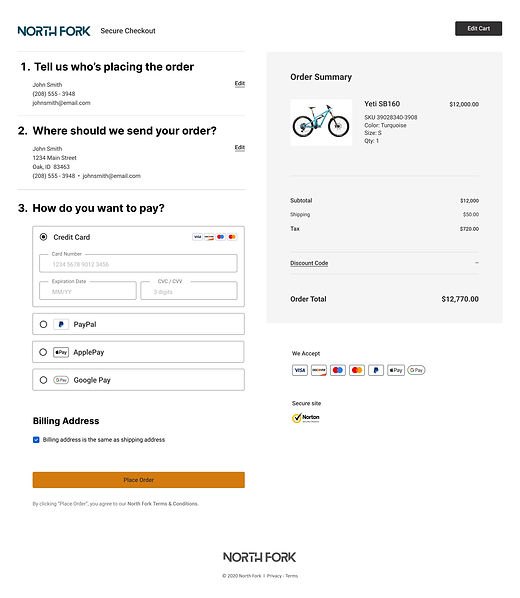
Checkout process
High Fidelity Usability Testing
Inuitive
Straightforward
Results from Flow 1
There was slight hesitation finding the sidebar (no longer than a second or two). Though when I moved the sidebar up higher on the screen it eliminated the hesitation because the user could see the full bar pop up when clicking the compare buttons. In the development stage, I would have the sidebar be sticky on the screen as the user moves throughout the site.
Results from Flow 2
Again, participants thought guest checkout was easy and what they would expect from a checkout process.
CONCLUSION
After completing the testing, results show that adding a compare button to North Fork's site will enhance the browsing experience for users and it will aide the user in their decision process. Testing also showed that all users opted to use the guest checkout in order to complete the purchasing process. This in turn will increase conversion rate.
For a future project, I would test adding an animation to the sidebar to help grab the user's attention more quickly.
