kellie thompson


INTRODUCTION
Role: UX/UI Designer Duration: 5 Days Tools: Figma, Photoshop, Illustrator, Paper, Pen
House2Home is an ecommerce website that sells home decor items and accessories. H2H wants to help people decorate their homes and apartments. With an opportunity in the market for H2H to add starter kits to their product line, a design sprint is being used to test a possible solution.
UNDERSTAND THE PROBLEM
Surveys were done and H2H found that many of their customers just moved into a new apartment or home. Wanting to personalize their space with cohesive decorative items, users don't feel confident in buying items on their own.
MEET OUR PERSONA

Ally
23 years old • Chicago, IL
I know my style and have saved photos on Pinterest of what I like. But I don't have a huge budget, so the stuff I buy need to make the most impact in giving my apartment the look and feel I want.
ABOUT
Ally is a recent college graduate and recently moved into her first rented studio apartment in Chicago. Living on her own for the first time, she is excited to decorate her apartment with her own style.
Ally saves photos of bright and lively rooms in small apartments and rooms on Pinterest. She uses these photos to get inspiration for how to decorate her apartment.
She takes time to shop but gets overwhelmed and puts off purchasing for another time.
FRUSTRATIONS
• Knows her style but doesn't know what to items to buy
• Wants to buy items that fit within her budget
• Wants decorative items that have an impact on apartment
• She doesn't what items will look good together in her space.
GOALS
Ally wants a buy decorative items for her apartment with her style and stay within a her budget.
SYNTHESIZING
THE RESEARCH
DAY 1
I find lots of cool little items that I like, but I never know if they'll all look together in the same room until I buy them. Usually, I get overwhelmed and end up not buying anything. - Dan

UNDERSTANDING THE PROBLEM
STYLE
I know the "look" I want..I just don't really know what products to buy to pull it off.
Deena
TIME
I want my place to look good but I never enjoy searching for decorations...spending time searching for stuff just gets tiring.
Ron
BUDGET
I moved into a new apartment and it was sooo empty... I know I needed a few things, but it was hard trying to stick to a budget.
Maria
SPACE
So many items look great in the staged photos, but will they look good in MY living room? You don't know until you order them and see how they look in the space.
Anna
Style, time, budget and space are pain points that stood out during interviews. These are areas I want to solve in my design.
• Can we help the user find a style they like?
• Can we create a bundle of items that create the look they are going for?
• Will our prices be affordable? Will we be able to allow the user to view these items in their homes before purchasing?
MAPPING
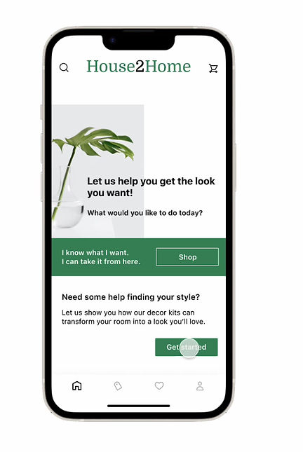
I mapped out the user flow that would be ideal for the H2H user.
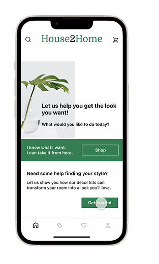
User clicks
home design
User selects
desired room and style
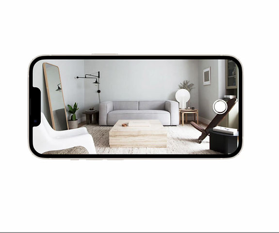
User takes pic of their room
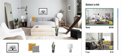
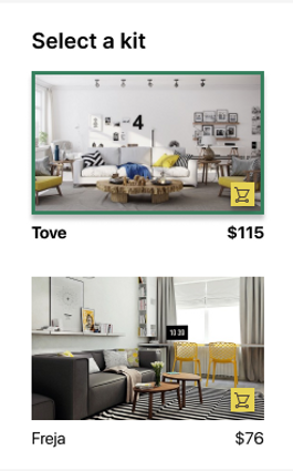
User selects a styled kit from inspirational photos
User completes
purchase
User can add kit to their cart
User is able to place items on
their photo
END OF DAY 1
I learned from Day 1 that the main pain points for H2H users were: the time spent looking for decorative items, not knowing what style they like, small budget and decorating for small spaces. Mapping out a step-by-step process will address these problems.
DAY 2
SKETCHING
I don't want to decorate my place with a bunch of tiny, cheap items...but I also don't want to spend all my money on one big thing. How can I get the look I want within my budget? - Lauren

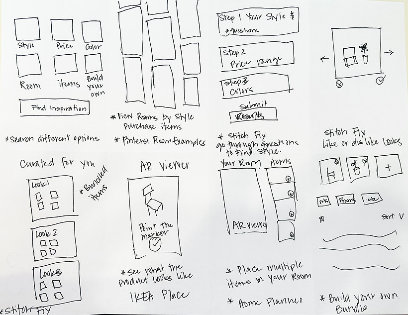
Today is the day to sketch! To get ready for sketching I did research on companies that could help with solving my user needs. Below are a few that stood out.
Pinterest is a great example of finding inspiration. Adding a design element like this would help guide a user to help them find what they like.
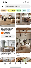
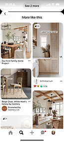
I also like their feature of being able to purchase
items in photos.
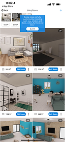
STITCH FIX
Stitch Fix does a great job showing bundled items together for a cohesive look. This would be a great way to show H2H users items that would look good together while still showcasing their style.

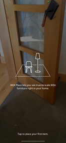
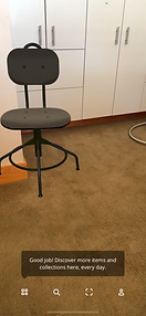
IKEA PLACE
IKEA Place has an awesome AR viewer that allows the user to virtually place an item in their own home. H2H could use an AR viewer to place items in their home to see if it works before they buy.

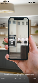
HOME PLANNER
This app has you take pictures of your room and you're able to virtually design your room with their products. This would work great with H2H. Allowing users to take photos of their rooms and adding products to their photos to see how the product would look in their space.
CRAZY 8'S
Sketching out my ideas, I found several ideations that would address style, budget, space and time.
END OF DAY 2
Day 2 was a time to find solutions. Exploring other companies and gathering ideas that could be adapted and improved on in order to find the best solution. Sketching out these ideas helps to visually see how these ideas would fit this design sprint. Next time I would try to get more "out-of-the-box" solutions, more innovative ideas.
DECIDING
DAY 3
I read a bunch of blog posts on how to decorate a small apartment. They always include 10+ items to buy - which ones should I get if I can only afford three or four of them? - Lindsey

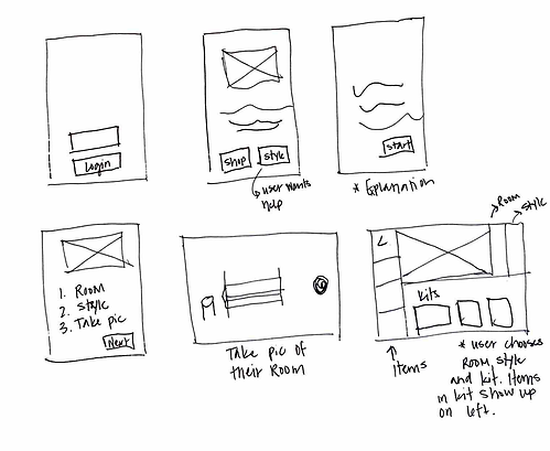
STORYBOARD
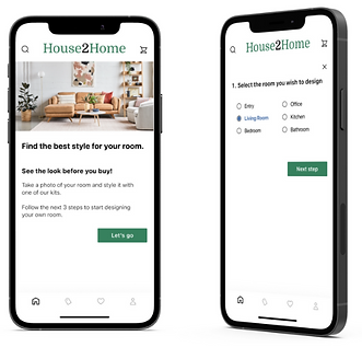
I went through several ideations when developing the screens for my storyboard. Some ideations weren't a big risk and were a bit mundane. These ideas didn't make the cut. The solution I chose was the route the user would take in order to be able to see what the items look like in their own space via a photo of their room. It was taking ideas from Stitch Fix and Home Planner that got me to this point.
END OF DAY 3
Day 3 I learned to make a decision on the best solution that would make the most impact on achieving the end goal. The storyboard visually shows the screen by screen process the user would take. When I do another sprint I would work more of the problems out during the storyboard process and not during the prototype phase.
PROTOTYPING
DAY 4
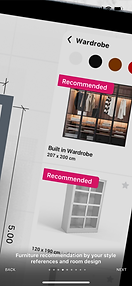
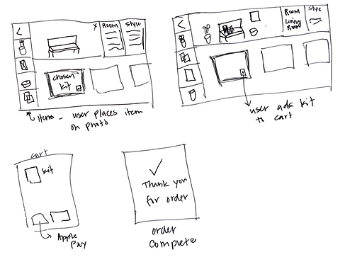
PROTOTYPE
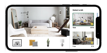
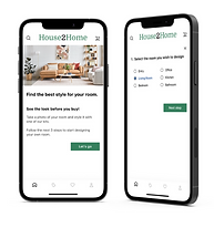
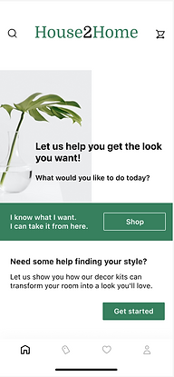
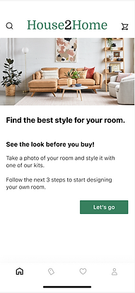
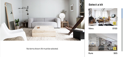
The prototype allows the user to see what a chosen kit, from a style and room of their choice, looks like in their own home. The goal is to give the user the confidence that the curated kit will look good in their space and complete the purchase. The UI structure was designed to feel effortless for the user. Each of the three steps the user takes has its own screen to reduce cognitive load and give the user a feeling of success. The kits are shown two at time to keep the screen from being overloaded with information and to allow user better visibility of the inspirational photos.
END OF DAY 4
I learned on Day 4 was a day of building a prototype. In order test out my idea on Day 5, I needed to have a functional prototype of my solution. I spent a lot of time on the interface when I just needed the bare bones to be able test the prototype. I could save a lot more time in this area.
TESTING &
RESULTS
DAY 5
USABILITY TESTING
Five users given the scenario of being first time renters of a small apartment looking to decorate their living room with a Scandinavian style but were sure what would look good in their space. How would they go about achieving this?
THE GOOD
All of the users found the step by step easy and straight forward. They really enjoyed adding the items to their room. They thought that seeing the bundled items in their room would increase their potential of buy the kit.
It is an advantage... I like it when I see a style with all of the items grouped together and I can put it my room. I know it will look good.
- Jackie
I can see what's in the kit and move the items around in my room. It would be nice to have a zoom in/zoom out feature to look at it closer.
- Layne
THE FRUSTRATION
When asked how they would go about purchasing the kit, ALL of the users struggled on finding the cart icon. Eventually they found it but had clicked on several different areas first. Adding the kit to the cart needs a new solution. I also needed a screen to show that the kit was added to the cart before the user got to the
SOLUTION
The cart icon needs to be more prominent on the screen. It needs to moved off the photos and put above the items in the kit. i.e "+ add kit to cart". I would make this change and retest to see if this will resolve the solution.
END OF DAY 5
Day of 5 I learned a lot from user testing. I would never thought I would have problems with the shopping cart icon being where it was but having fresh eyes on it alerted me to problem areas.
CONCLUSION
I learned quite a bit doing this design sprint. It is a great way to test risky ideas in a short amount of time. I know if I worked on a team we could come up with more innovative ideas. But this was great to test out one single idea and not have to wait months to see if is worth investing more time and effort into implementing it.